Nederlandse Spoorwegen
UI/UX UX RESEARCH APP DESIGNINTERACTION DESIGN PROTOTYPINGTwo million people in the Netherlands use public transport for their commute. To minimise disruptions in their journey, they depend on travel apps to monitor information and plan their trips accordingly. This can become a stressful, difficult and tedious endeavour for commuters who are tired, distracted and constantly on the move. So I designed a simple feature for the IOS mobile version of the NS Travel Planner app that (i) increases user awareness of the live notification function, and (ii) automatically redirects users to alternative routes in a way that seamlessly integrates with existing user behaviour.
COMPETITIVE ANALYSISThe initial scope of this design challenge is to design a solution that helps passengers wake up just before their train arrives at their station. Beyond the simple alarm function available on every smartphones device, I wasn’t aware of any existing solution that specifically addresses this problem. So I conducted a competitive analysis to identify what is currently available in the market.

These competitors were selected as the most popular and most developed solutions in the market. I looked into the tools and functionalities of their solution, and evaluated their strengths and weaknesses to uncover unique opportunities for my design. Location-based alarms are the most common solution, where users can preset alarms to set off at specific destinations and arrival times. While this mechanism offers more security against delays and disruptions than the traditional alarm, these apps are still separate from travel planning apps. The alarm notifications are not updated and integrated with live travel information, so its usability becomes limited when users experience a disruption in their journey. Furthermore, the lack of strong mobile navigation and visual components creates a negative impression of the user experience.
USER INTERVIEWSAlthough I now have a clearer understanding of what I’m starting with, I still need to determine whether this problem creates a significant demand for businesses and customers alike. Typically, a semi-structured interview is conducted to gain valuable insights during this stage of the research process. Users can describe — in their own words — their feelings about the problem and their experiences with existing solutions. It also enables researchers to create a comprehensive map of users’ behaviours, motivations, needs and pain points. I specified that the user is someone who uses public transport in the Netherlands on a regular basis, and conducted three user interviews with participants who fit that profile. The interview notes are then sorted according to themes, which I organised into an affinity map.
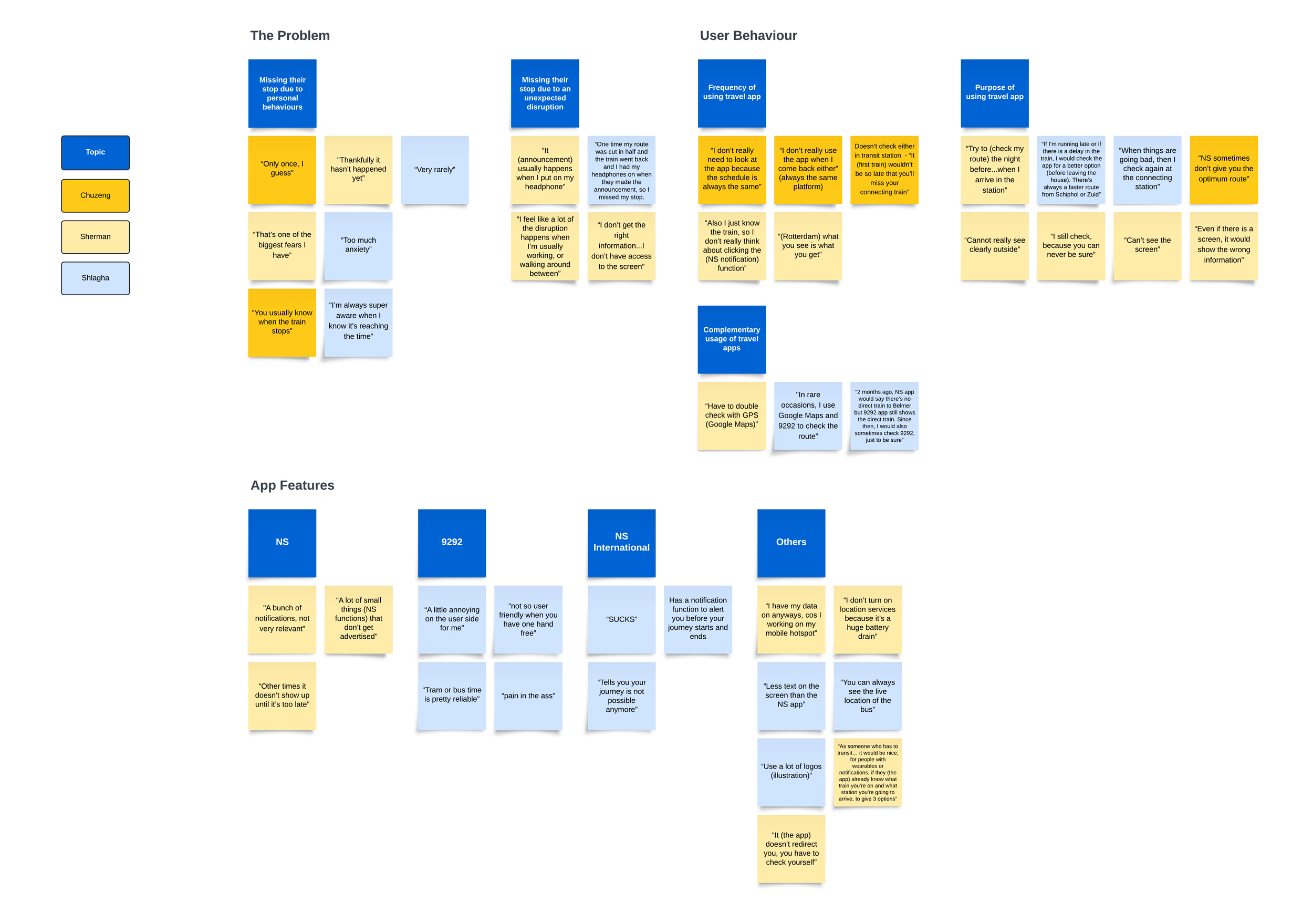
During the interviews, it was slowly becoming clear to me that the initial assumption I was working with is incorrect, and that I might be focusing on the wrong problem altogether. The reason users miss their stop is not because they fell asleep and lost track of time. In fact, they have an almost intuitive sense of knowing when their station is approaching, even if they are not completely focused. Instead, they revealed a problem which is similar, but requires a very different solution altogether. Users miss their stop when they are distracted during unexpected train disruptions.
“I feel like a lot of the disruption happens when I’m usually working, or walking around between”
INSIGHT #1: SETTING All users start their journey by train.
All users use the NS Travel Planner as their go-to travel app.
DESIGN ACTION #1 Develop a solution that integrates with or improves on an existing function in the NS Travel Planner app.
Optimises an established design and customer base which reduces R&D costs and the users’ learning curve.
INSIGHT #2: USER JOURNEYAll users transit during their commute, increasing their susceptibility to travel disruptions.
There is a lack of visible information in the users’ environment, which creates uncertainty during the journey.
“It (announcements) usually happens when I put on my headphone.”
Users have strong feelings of anxiety & uncertainty about missing their stop.
“I’m always super aware when I know it's almost time.”
Users appreciated the notification function that other apps offer, which alerts users at the start and end of their journey.
“Like an airport chime.”
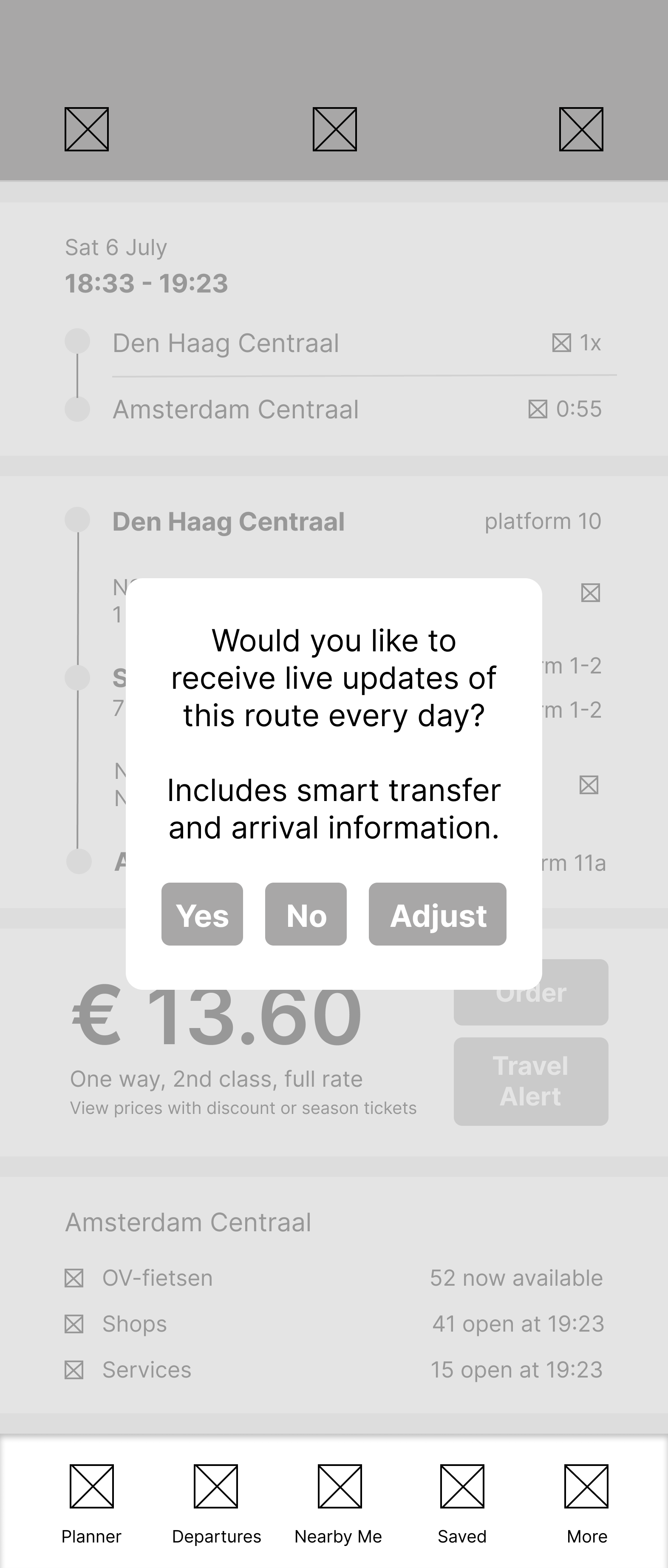
DESIGN ACTION #2 Design a pop-up window asking the user if they would like to receive live updates and transit information of the route they just looked up.
Increases user awareness and decrease user resistance to the NS notification function.
INSIGHT #3: USER BEHAVIOUR All users have planned a primary route, along with several alternative routes to take if their primary route is affected by disruptions.
When there is uncertainty about a route’s reliability, users will check and compare live updates across several apps.
“If there is a delay, I would check the app for a better option. There’s always a faster route.”
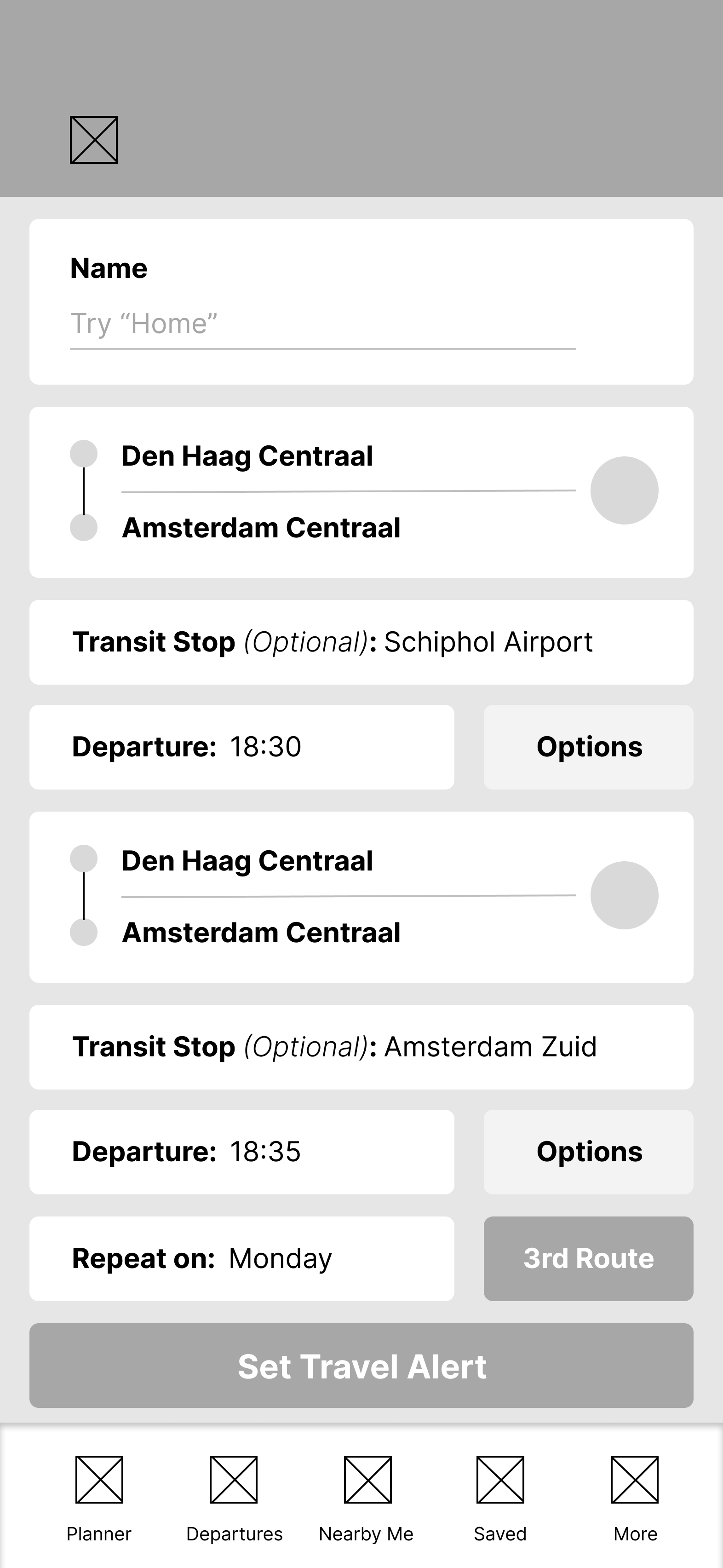
DESIGN ACTION #3Create a display menu that allows users to customise a second route that they’ll be automatically directed to if their first route is no longer available.
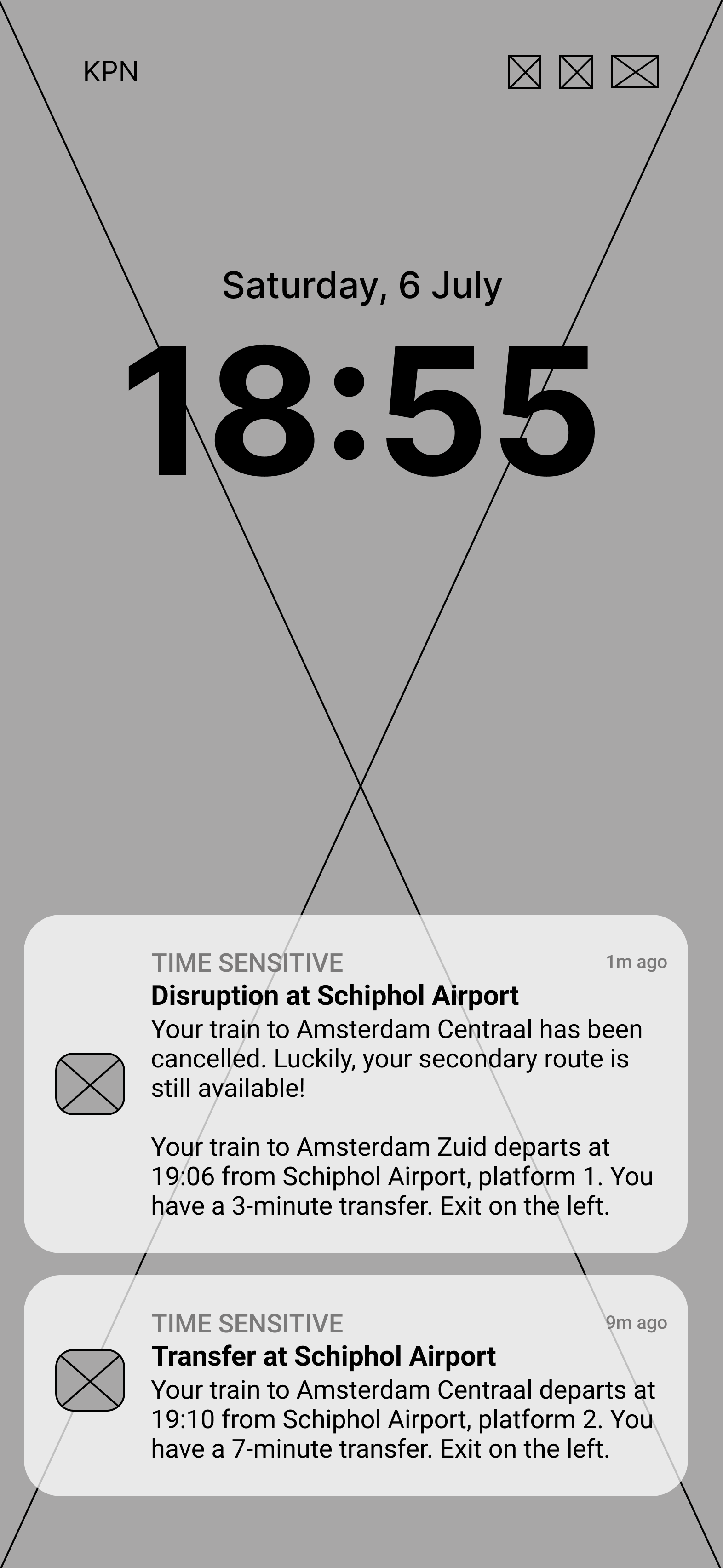
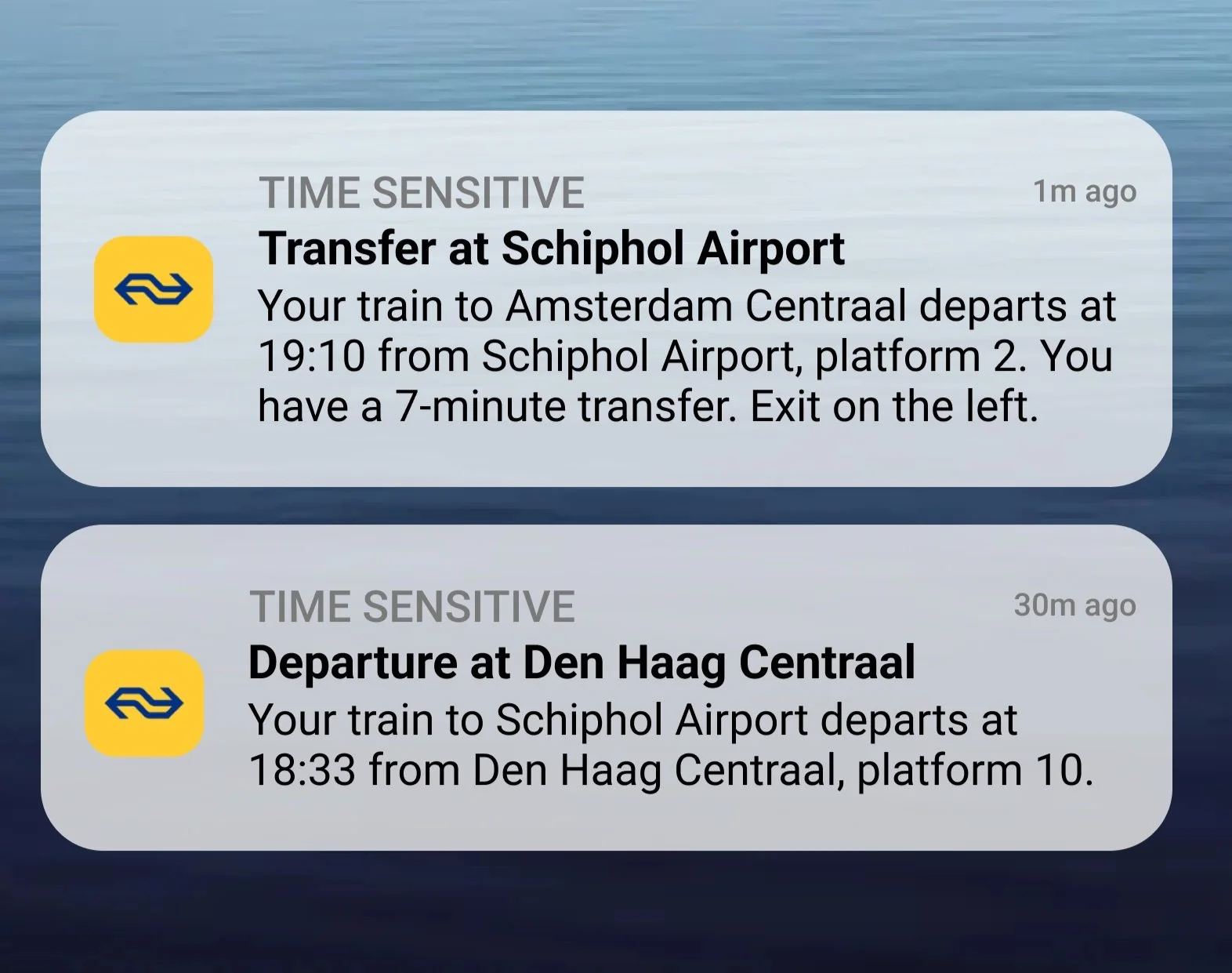
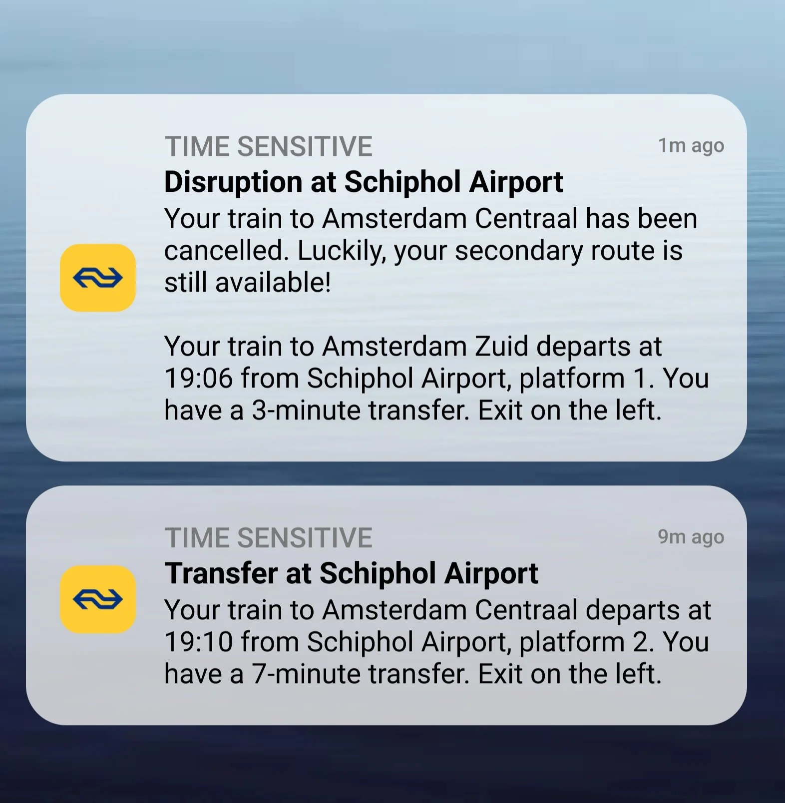
Include directions to their second route when users receive a disruption alert in their home screen notification.
INSIGHT #4: APP FEATURESUsers complained that the NS Travel Planner app doesn’t redirect users if their planned route is disrupted.
“Just tells you your journey is not possible anymore.”
Users recommended that the NS Travel Planner app should automatically provide alternative route options in the event of disruptions.
“As someone who has to transit… it would be nice, for people with wearables or notifications, if (the app) already knows what train you’re on and what station you’re going to arrive, to give 3 options.”
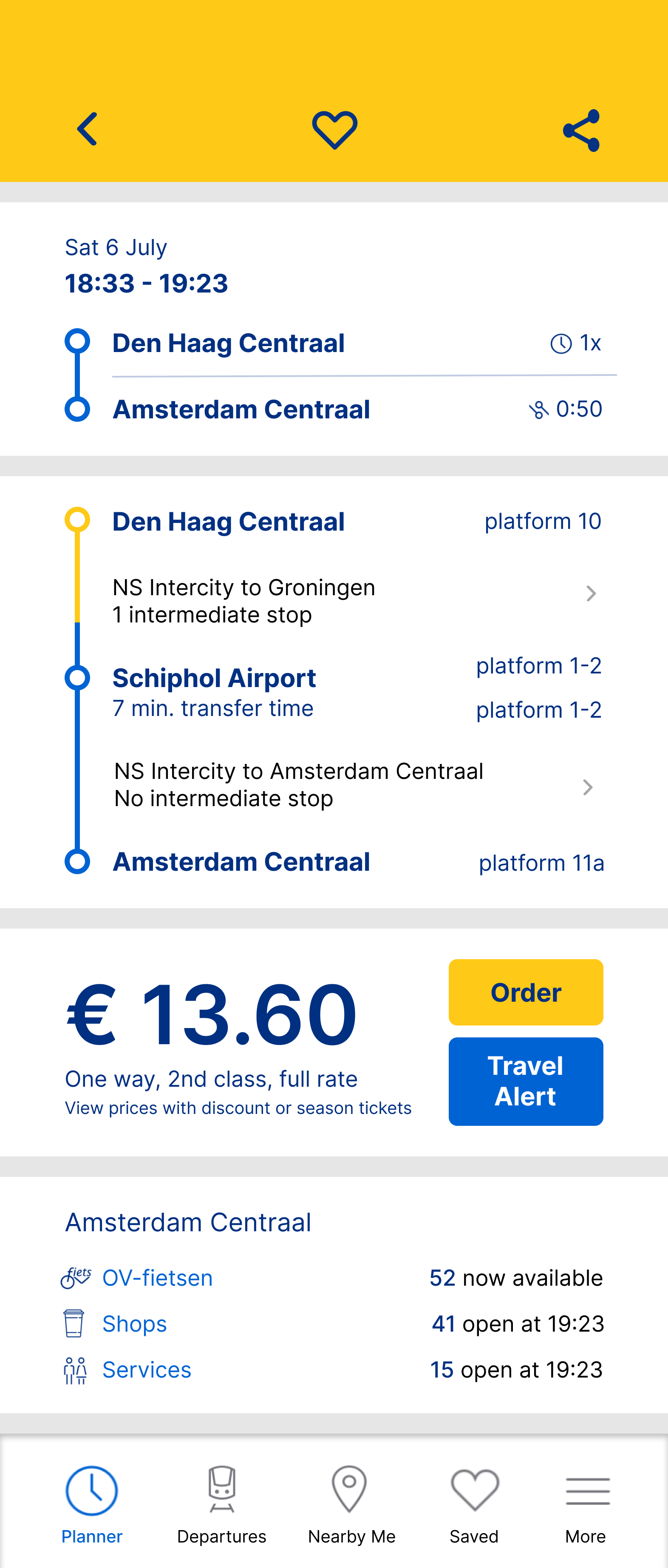
DESIGN ACTION #4Show three alternative route options under “Planner”, which users can access directly when they receive a disruption alert in their home screen notification.
Maintain the same interface design where users search and plan their routes for a seamless user experience.
I have concluded that the user is a habitual creature who has a complete understanding of their commute. However, the reality of transits means that a user’s commute is more susceptible to travel disruptions, forcing them to develop countermeasures to bridge the information gap (eg. using different travel apps, planning several alternative routes etc). Yet, this solution is far from ideal. Users now have to deal with an overload of information, which makes it difficult and stressful to focus and navigate through the motions of their commute. Overall, there are many opportunities for users to become distracted, make mistakes, and miss their stop throughout their journey. I synthesised these insights into design actions to begin the ideation process and design improvements in the NS Travel Planner app which would assist users when their journey is disrupted without compromising the quality of their commute.
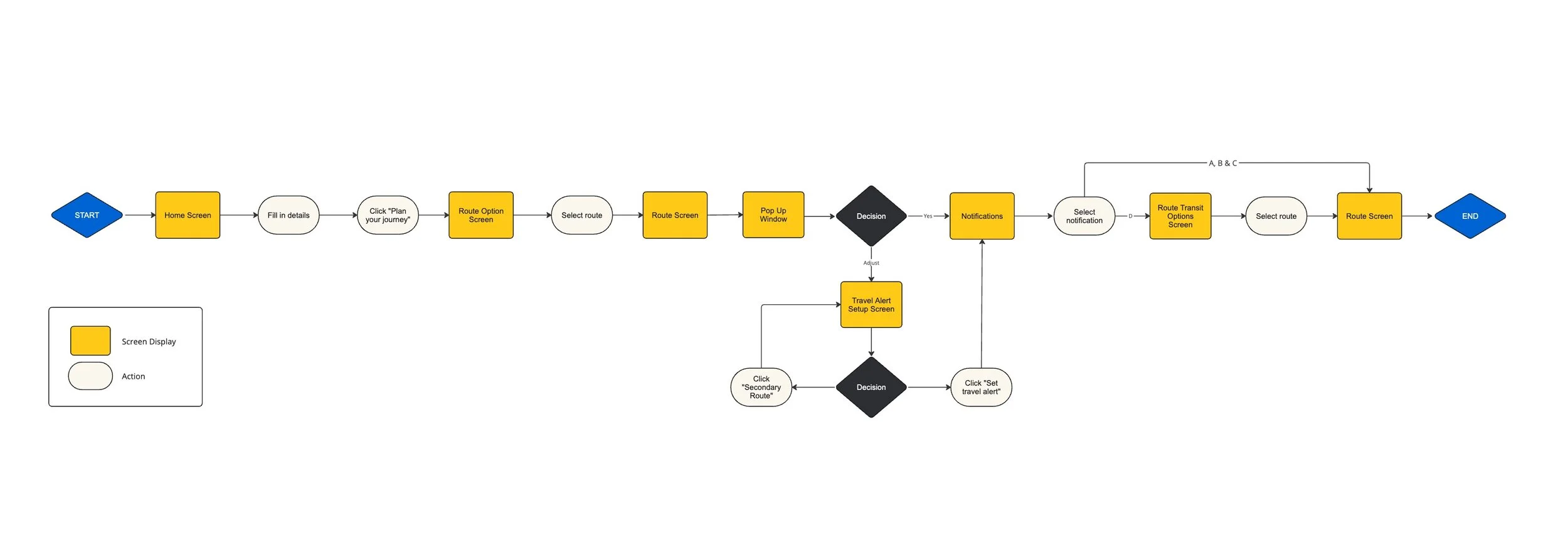
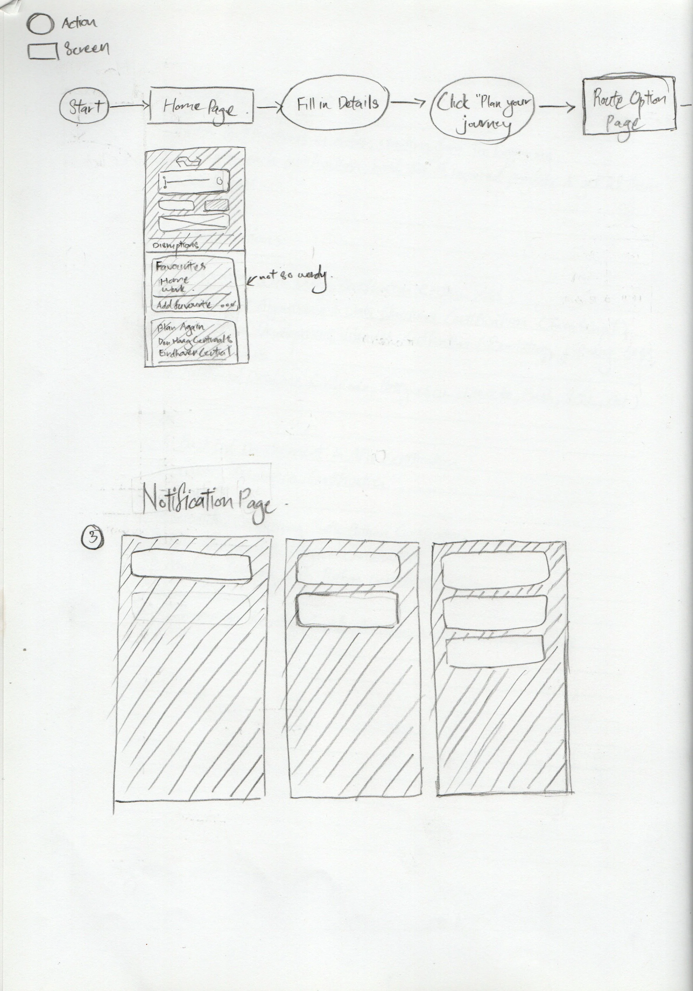
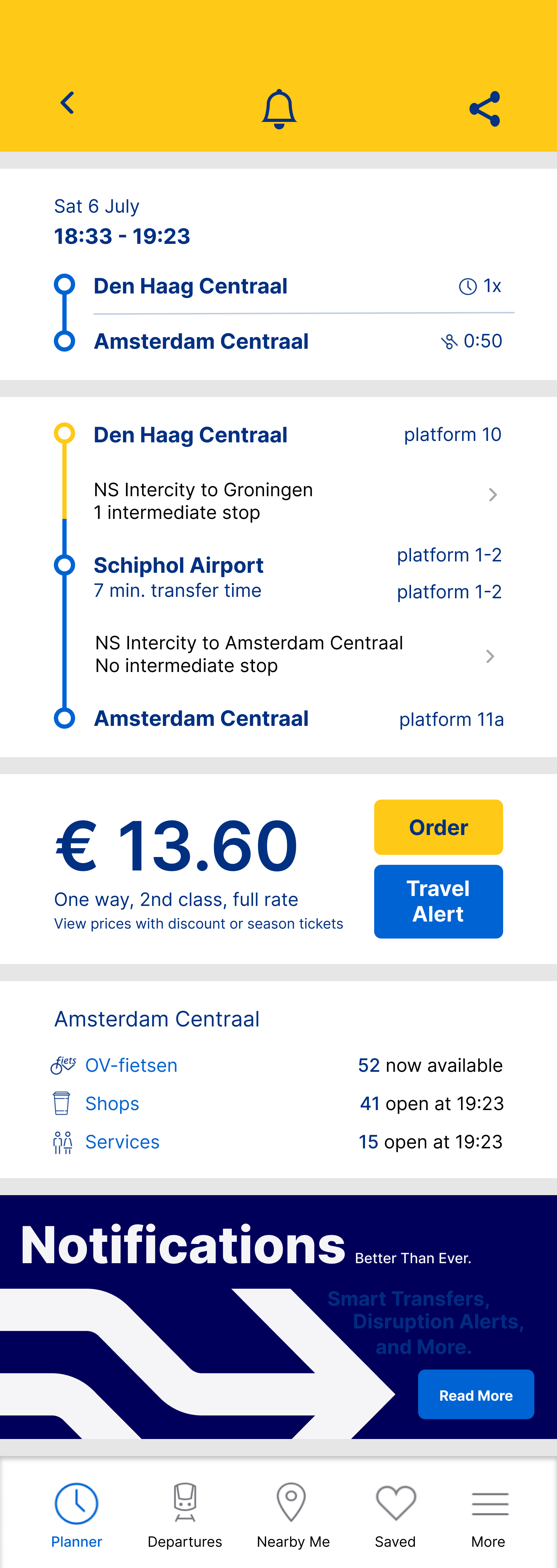
TASK FLOWFirst, I mapped out a task flow that incorporates my design improvements into the steps a user would typically take while using the NS Travel Planner app. This ensures integration optimisation in the user process, and makes for a clear, systematic and research-based wireframing and prototyping process.
WIREFRAMESI started sketching low-fidelity wireframes of the NS “Planner” screen, the notification settings screen and the home notification screen. Taking into account the NS Travel Planner app design, I rendered out my sketches into mid-fidelity wireframes which outlines the screens’ layout with text and image placement.
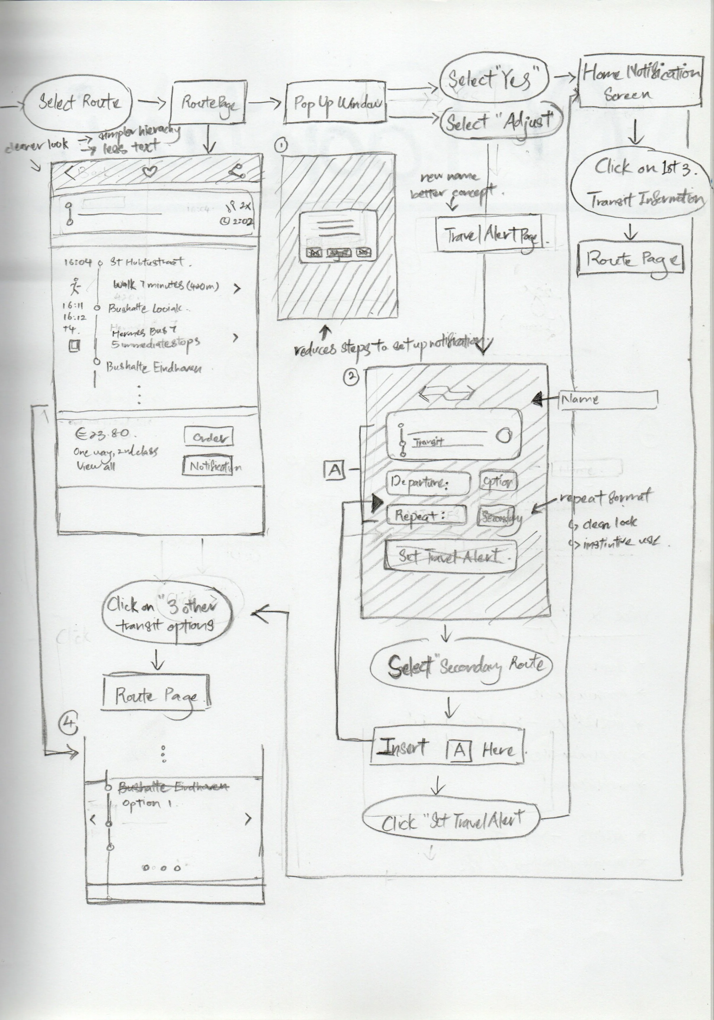
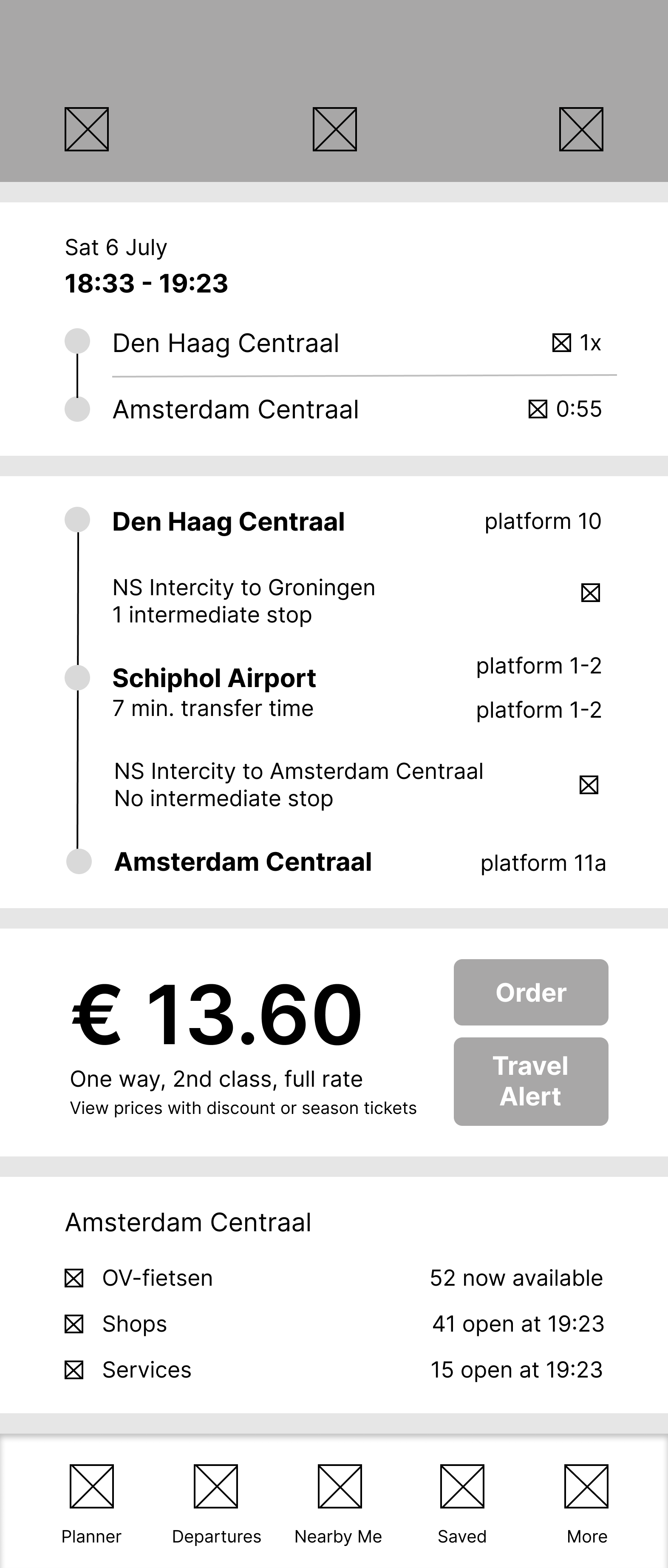
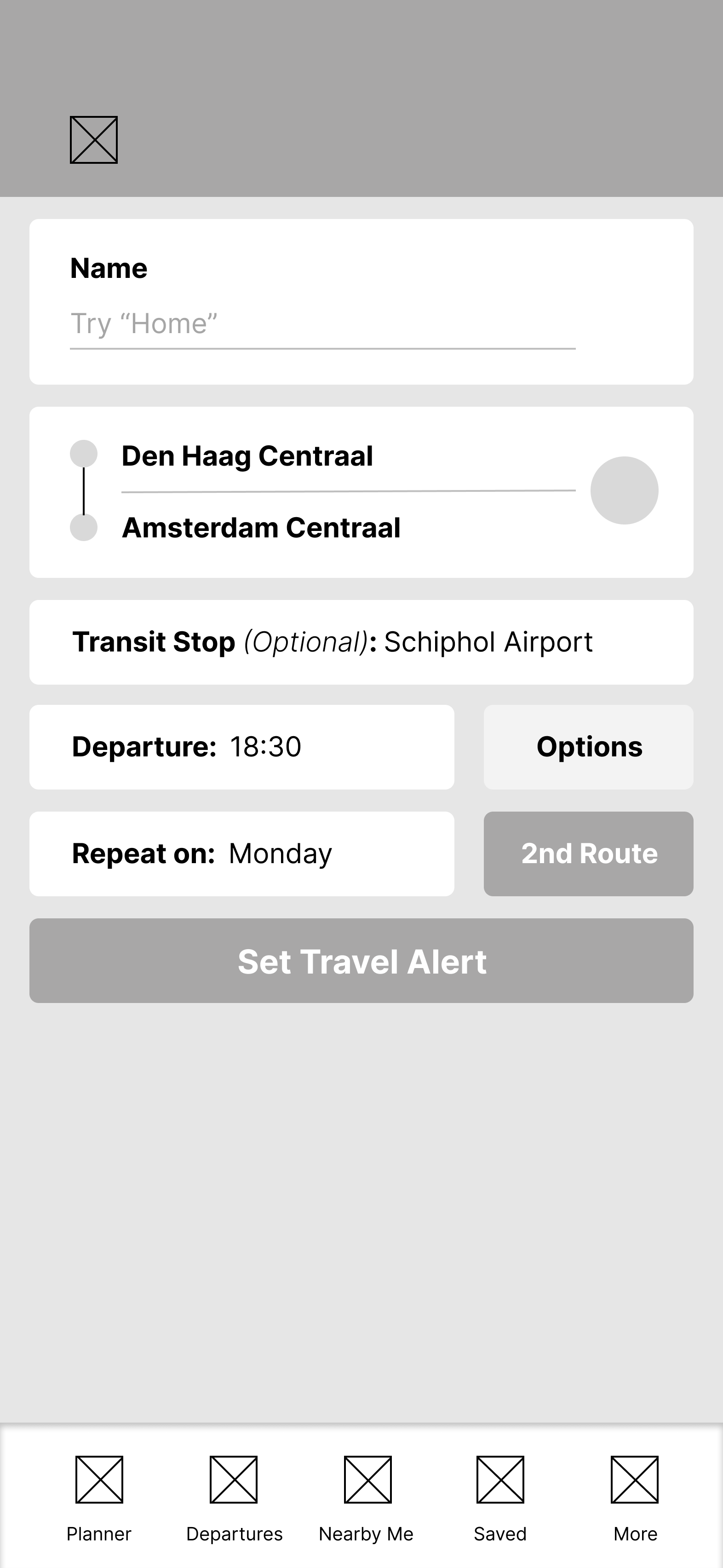
PROTOTYPEI completed my designs with the signature fonts and colours of the NS brand. I also decided to add a second pop-up window during the notification setup process to highlight the feature where users can setup and receive notifications for an alternative route. Finally, I converted these high-fidelity wireframes into a clickable prototype that will be used during the usability testing phase.


USABILITY TESTING & ITERATIONSI prompted two participants to complete the following task using the prototype. You are on your way home from work. Use the NS app to check if your route is being affected by train disruptions. If your route is no longer available, please do your best to navigate the app in search of a better route. I observed how they engaged and interacted with the interface, which allowed me to determine and evaluate the efficiency and intuitiveness of my design’s task flow. Any confusion and difficulties that the participants experienced would be flagged as an issue that needs to be work on during the revision stage. The usability test also offers an opportunity for users to describe how they generally feel about the new app features.
INSIGHT #1: CONTEXT
Participants had no problems navigating the prototype and completing the task. This success was attributed to the layout and structure of the interface, which was clear, simple and familiar. The strong hierarchy and bold styles of the text and buttons also gave participants an intuitive sense of the actions they needed to take to move on to the next screen.
However, there were times when participants were confused about the context they were placed in. They weren’t sure which stage of the train journey they were in at the moment, and had to spend some time corresponding their expectations of the journey with the screens. Namely, there were steps in the task flow that were not accounted for in the design, leading to abrupt transitions between screens. This did steer focus away from the main goals of the usability test, and had an effect on their overall impression of the prototype.
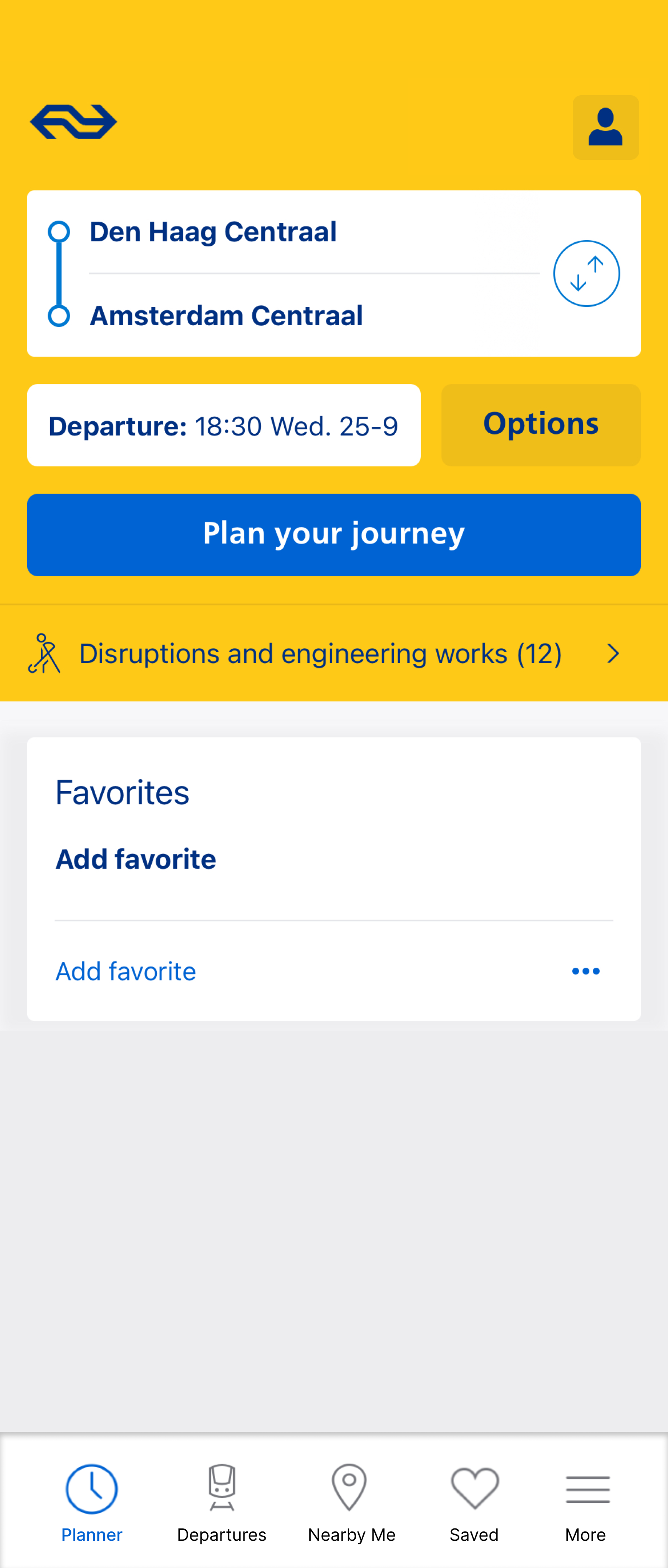
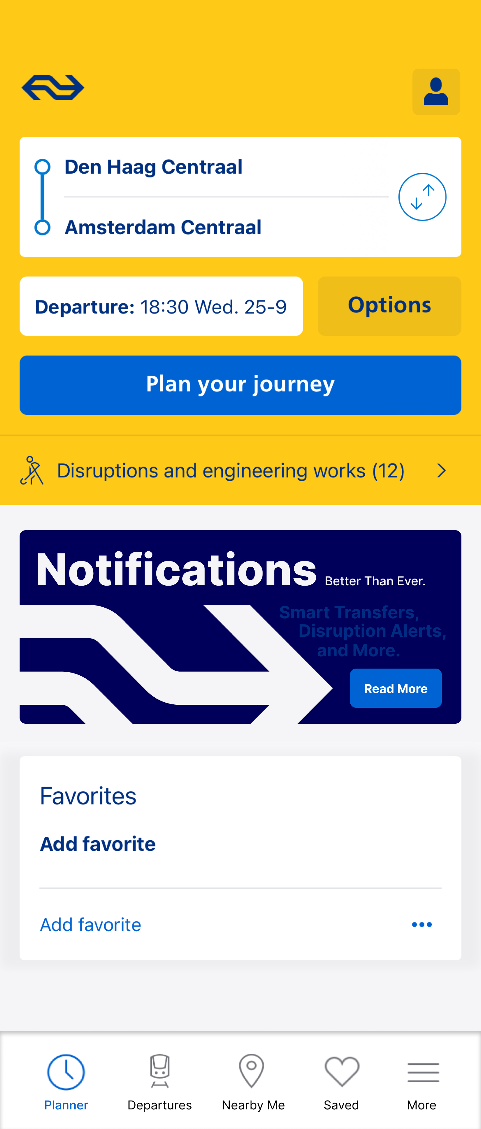
Start the design by showing basic details of the commute in the search bar of the app home screen.
Design a confirmation screen after users have completed the notification setup process.
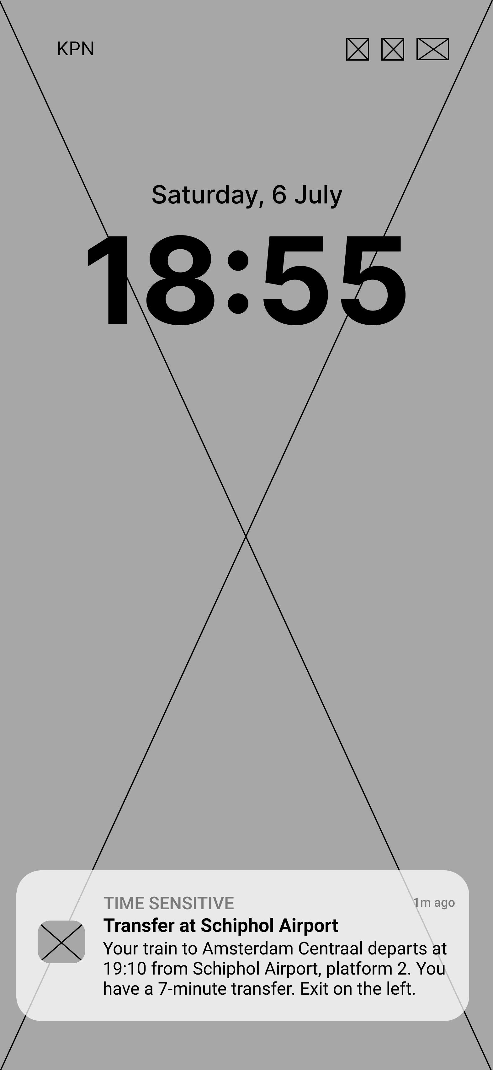
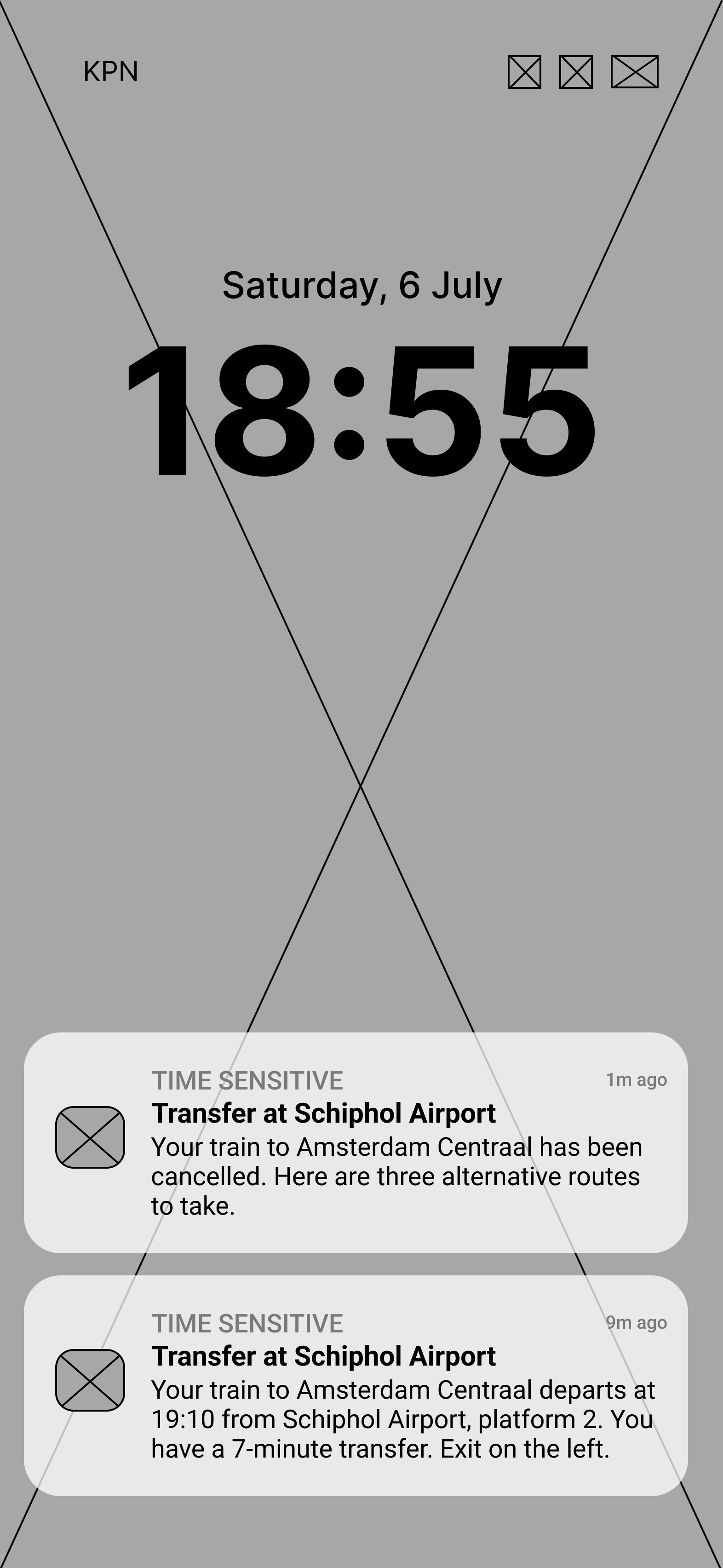
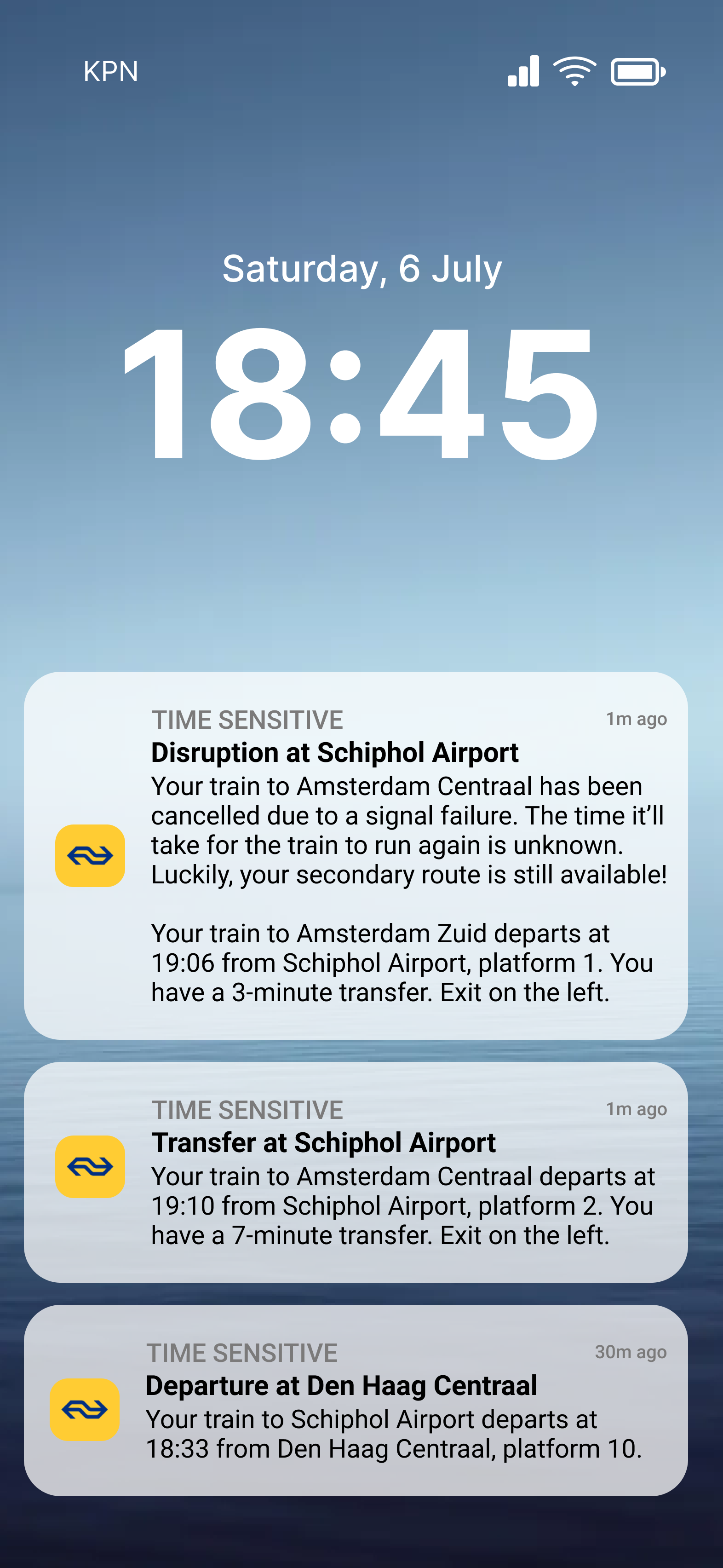
Indicate the start of the commute with a home screen notification that displays information about the first half of their journey (Den Haag Centraal to Schiphol Airport).
Modify the “Planner” screen to represent information on their secondary route after their train has been cancelled the first time.
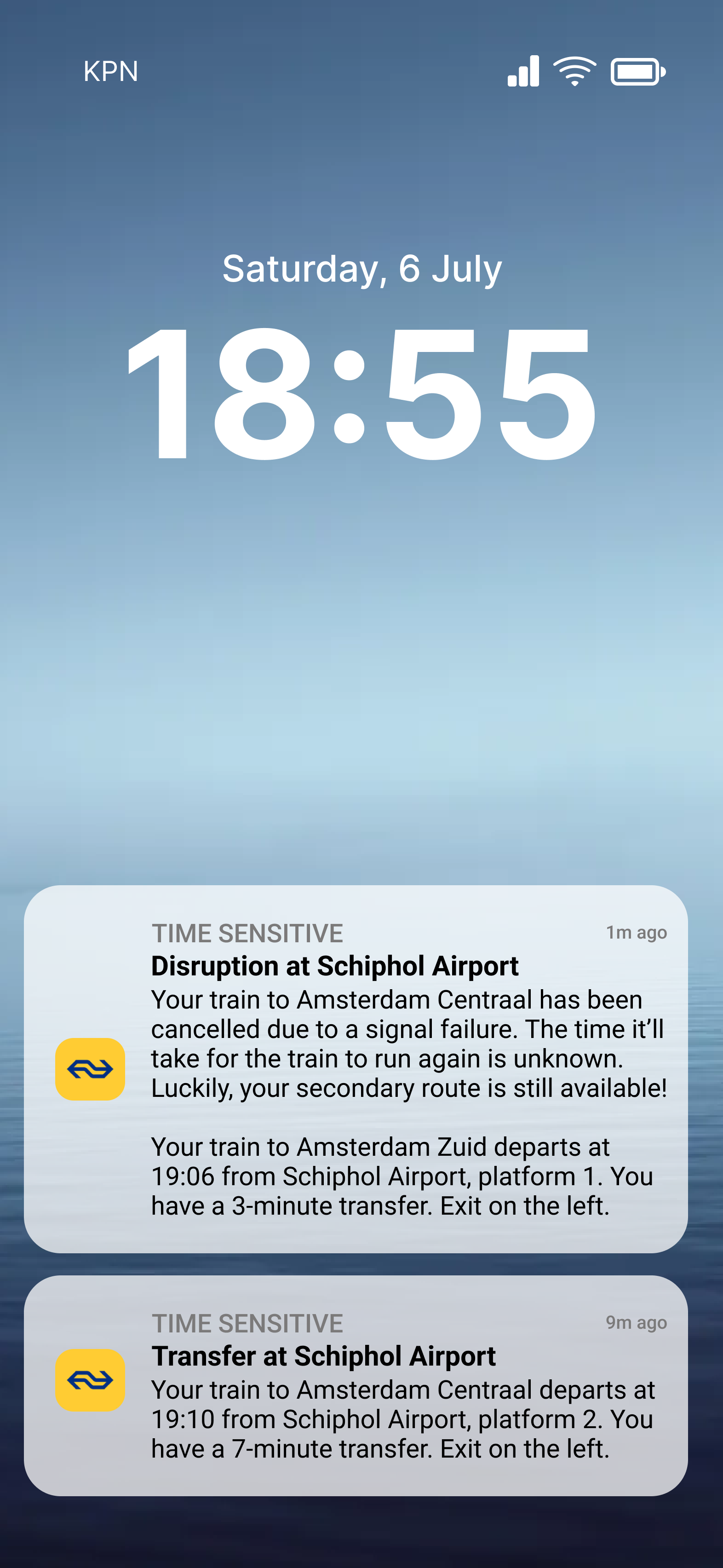
Include more information about the disruption itself when users receive a disruption alert in their home screen notifications.
REVISION #1
Prototype
Iteration
Prototype
Iteration

Prototype

Iteration
Prototype
Iteration
Prototype

Iteration

INSIGHT #2: POP-UP WINDOW
Participants generally appreciated improvements that were made in the app. They understood the importance and utility of features like being automatically redirected when their original route is no longer available and the option to customise the route they wish to be redirected to. They also agreed that notifications were a good way to communicate travel information to users during a busy commute.
However, I observed that both participants have an instant reaction of clicking “No” when they encountered the pop-up window during their usability test. This negative response was attributed to a general dislike for pop-up windows, as well as terrible experiences with the current notification function that NS provides. The timing was also not conducive, as users are usually rushing to check their route when they’re on the “Planner” screen, and does not like to be pulled away from their main task.
REVISION #2
Design an advertisement banner in the app home screen and at the bottom of the “Planner” screen.
Replace the heart icon at the menu bar on the top of the “Planner” screen with a notification icon.
This form of advertisement will inform users about the new features of the notification function without hindering critical tasks. Its stationary position in the background of frequently visited screens acts as a constant reminder that notifications are available in the app. As time passes by, interested users will want to discover the new features for themselves. They can then find out more information via a link in the banner, which can help instill trust and credibility while dispelling users’ presumptions based on their previous experience of the old notification function.
Prototype
Iteration
FINAL PRODUCT


REFLECTIONIt was very refreshing to begin the design process with a thorough investigation of the problem, user and context. Taking the time to work through these details helped me focus my efforts during the ideation stage, which ensures that the choices I made in my designs were strategic, impactful and rooted in research. Although the prototyping process was similarly extensive, I wished I had more sources to draw insights from to increase the depth, rigour and reliability of my design revisions.
A good design is also defined by its execution. I foresee that this project will inevitably face drawbacks and complications during the implementation stage, as the features I designed for the NS Travel Planner app also depends on the functionality of their notifications, which is currently lacking. Users have complained that the app notifications they’ve received are slow, inaccurate and unhelpful, which aggravates the problems that users experience during their commute. Technical and engineering capabilities should be consulted first before any of the suggestions above can be pursued successfully.